TidyTuesday visualisations
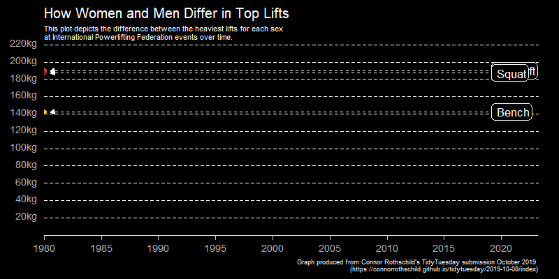
Powerlifting
This week I thought I would explore the use of gganimate package to animate a ggplot graph. Connor Rothschild's, a undergraduate at Rice University, has created an excellent 2019 week 41 TidyTuesday submission, producing an animated line graph showing the differences between men and women's heaviest lifts. This used both the ggplot2 and gganimate package so I thought I would work through his code to start to understand how to apply animation to a ggplot.
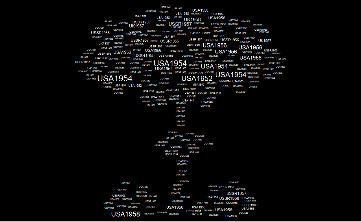
Nuclear Explosions
Nuclear Explosions dataset provided for 2019 week 34 dataset allowed me to explore creating a word cloud of atomic explosions carried out between 1945-1998, masked with the shape of a mushroom cloud for additional effect!
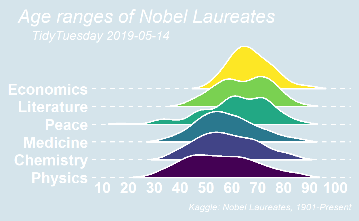
Nobel Prize Winners
Using week 2019-20 TidyTuesday Nobel Prize Winners dataset this week I took the opportunity to explore ggridge plots, plotting age of nobel prize winners for each of the six Nobel Prize Winner categories Economics, Literature, Peace, Medicine, Chemistry and Physics. I also had a look at themes in ggplot2 provided by additional packages ggthemes, ggdark and hrbrthemes, which have been retained but commented out in the code.
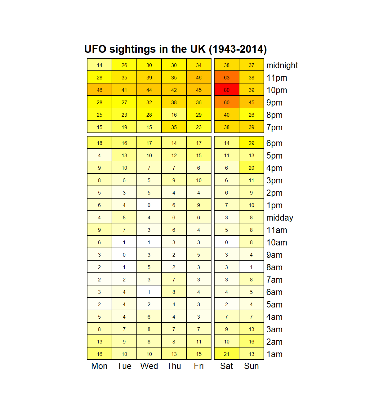
Global UFO sightings
This script uses week 2019-26 TidyTuesday dataset on UFO sightings around the world, extracting the UK sightings to create a heatmap of the number of UFO sightings in the UK for each day of the week. I was also going to produce a static map to plot the UFO sightings, finding a useful UK basemap from the rnaturalearth package but in the end didn't get round to finishing it. The code with the UK base map is there in case it is useful in the future!